Advertisement
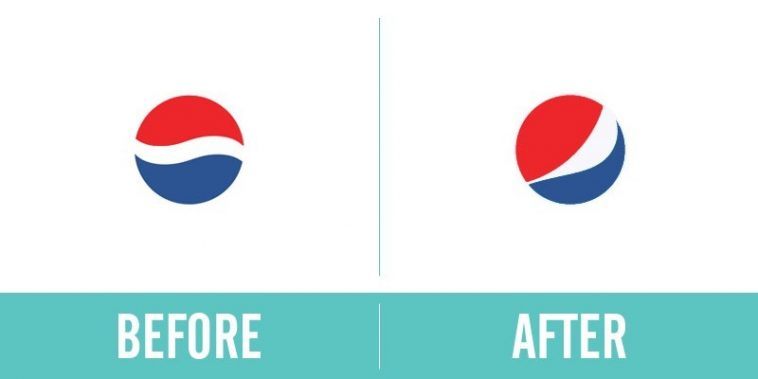
18. Pepsi
Okay, so this may be the best con ever. This is Pepsi’s old logo. Now, when they went hunting for a new look, they got a 27-page document detailing the new logo’s origins in Feng Shui, the Renaissance, the earth’s Geodynamo, the theory of relativity and more. And then Pepsi gladly handed over a million dollars for their old logo simply tilted on its side. I wonder if their re-branding was done by the same people who handled Adidas.
Advertisement

Advertisement
